Bad: Blackboard
Blackboard is not a student user friendly site; it has many functions that are not useful, and it is not user friendly on the teacher side either. First, the site is not visually appealing because the simple design does not look clean. After logging in, the MyCLEmson tab is nearly useless with nearly nothing that I use on that page. The only reason I check blackboard is for new documents and grades. To find these two things, I must make at least four clicks, and usually more, to even see if there is something new for me to look at. On the main page after logging in, nothing on the left column of the page I have ever clicked on. And I usually don’t click on the courses on the right side either because they take longer to load than clicking the Courses tab at the top of the page. Not being user friendly on the teacher side is an assumption I have made based off of what I see as a student. Announcements, tasks, and calendar events are never posted so I must go through each individual course to figure out when are all test days and assignments. I assume that if they were easy to post or automated the teachers would put them up. If blackboard was designed better, there would be more of an automated filling in of the calendar and tasks for the student as well as a better notification system for new content.
Good: Pandora
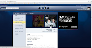
Pandora is an ingenious internet radio site. In addition to the brilliant idea of the site, the design of the site is pleasing to the eye and simple to use. The welcome screen while loading is blue with circles and simply says PANDORA. It has no slow loading of parts of the page or a bar that goes to 99% and stays there.

After loading, the only screen is the main one, so no more waiting for pages to load. From the main screen, on the top left there is a simple search bar for creating new stations. All your current stations are listed clearly down the left column. What is now playing is in the dark blue box in the middle with the album art and a description below of the song. Finally, the play and thumbs up/thumbs down button are clearly at the top next to the sound. This site has gone through a renovation since I began using it and the web designer did a great job of improving their previous design. Now it is all blue and simple, just like Facebook.

I agree, Grace. Blackboard is the worst!
ReplyDelete